")
HEALTHCARE & MEDICAL WEBSITE DESIGN Company & Services
INCREASE PATIENT APPOINTMENTS WITH MEDICAL PRACTICE WEBSITE DESIGN SERVICES
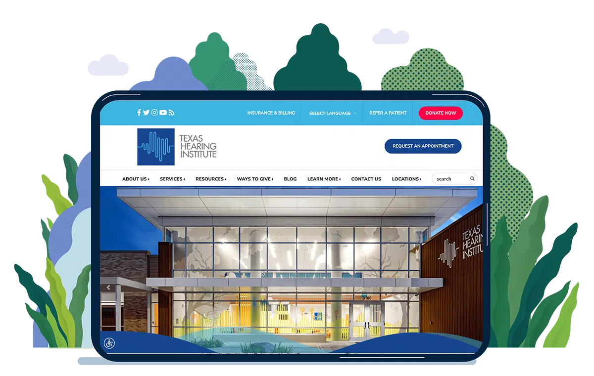

DRIVE NEW PATIENT APPOINTMENTS With A Professional Medical Website Design
Get the most from your website by having it set up for engagement and seamless new patient acquisition.
In today’s digital age, having a medical practice website is no longer optional. Having an online presence allows healthcare providers and medical professionals to connect with potential patients, establish credibility, and ultimately grow their practice. Medical practice websites are essential for reaching patients where they are spending the majority of their time — online.
But how can web design drive more new patient appointment requests? With a few simple changes to the layout, clear communication of steps, and a simplified process of capturing information, your website transforms into a powerful tool for new patient lead generation.
WHY A MEDICAL PRACTICE MUST OPTIMIZE A WEBSITE FOR PATIENT ENGAGEMENT
Not only does your website provide essential information to your patients, but it can also attract new patients and make it easier for existing ones to book appointments or contact you. However, it’s not enough to just have a website - it needs to meet the needs of your patients.
When you work with a website development company specializing in the healthcare industry, you get a website including all the essentials needed to provide an online experience that compels visitors to become new patients.

WEBSITES BUILT BY EXPERTS IN HEALTHCARE MARKETING
Not only does your website provide essential information to your patients, but it can also attract new patients and make it easier for existing ones to book appointments or contact you. However, it’s not enough to just have a website - it needs to meet the needs of your patients.
When you work with a website development company specializing in the healthcare industry, you get a website including all the essentials needed to provide an online experience that compels visitors to become new patients.
- EASY NAVIGATION
Patients need to be able to find the information they need quickly and easily.
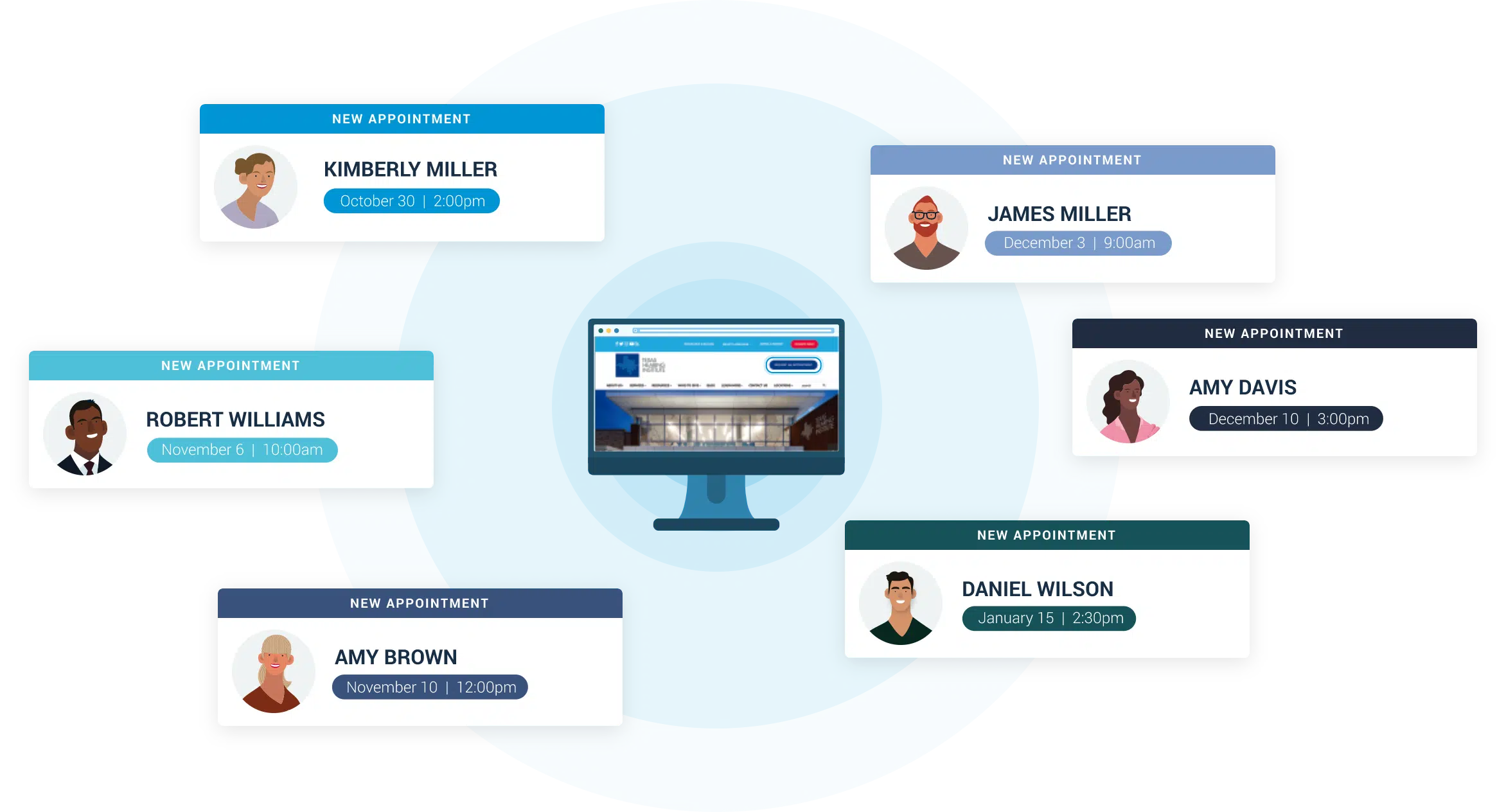
- ONLINE BOOKINGS
Many patients prefer to book appointments online, rather than calling the practice. If your website doesn’t offer online booking, you are likely missing out on new patient acquisition opportunities.
- MOBILE FRIENDLY
With more and more people accessing the internet on their mobile phones, it’s essential that your website is designed to be mobile-friendly.
- CLEAR AND CONCISE
Patients don’t want to hunt through pages of dense text and click around the site to find the information they need.
- TESTIMONIALS & BIOS
Patients want reassurance that they are making the best choice for care. Including patient testimonials and provider bios on your website can help to build trust and establish credibility.
- PATIENT REFERRAL FORM
A custom form on your website simplifies the process for referring physicians, eliminating the need for phone calls or physical forms.
About Our Medical Practice Website Design Services
Every practice is unique, so we create websites that reflect strengths that distinguish your practice from others. Our medical website designers will work closely with you to understand your goals, services, and target audience, ensuring a tailor-made presentation that sets you apart.

PATIENT ENGAGEMENT
Our website designs are optimized to engage prospective patients and drive increased appointment requests.
SEARCH ENGINE FRIENDLY
We design websites with search engine optimization (SEO) in mind. Our team will implement SEO best practices during the design process, helping your website rank higher in search results.
LOCATION MAPS
If you have multiple practice locations, we’ll provide pages for each along with a searchable map, making it simple to find the nearest location.

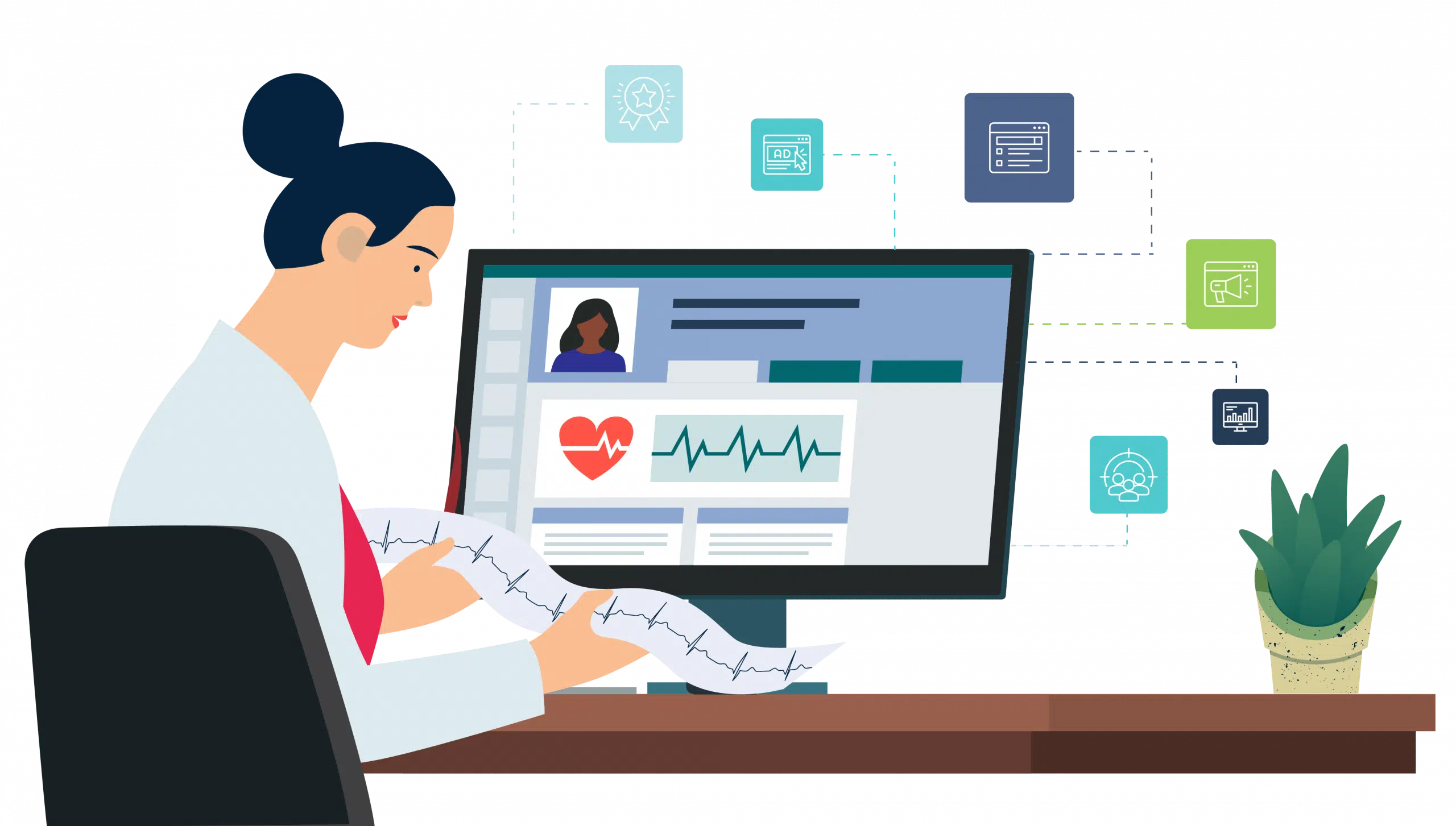
ANALYTICS DASHBOARD
You’ll receive access to a real time dashboard displaying current website statistics at the click of a button.
ONGOING SUPPORT AND MAINTENANCE
Our services don’t end when a website goes live. We offer ongoing support, maintenance, and security updates to ensure your website remains secure, up-to-date, and performs at its best.

What Our Customers
Are Saying
Leslie Branon
Community Relations Texas Orthopedics
Chris Bolduc
Bolduc Physical / Aquatic Therapy & Sports Medicine
"The team here was very helpful. I had several issues and they were immediately on top of it and got everything solved for me no matter how many issues i bothered them with. They were kind and polite and never once got frustrated with me. I am very appreciative toward them. They have done excellent work for my website here at Serenity Hospice and it is so much more than i could have asked before, they truly went above and beyond."
Madyson Osborn
Serenity Hospice
"iHealthSpot Digital Marketing has been an incredible partner for our business. Their team is highly skilled, creative, and dedicated to helping us achieve our marketing goals. From designing engaging campaigns to optimizing our online presence, iHealthSpot has consistently delivered exceptional results. We highly recommend iHealthSpot Digital Marketing to any company looking to elevate their digital marketing efforts. Thank you, iHealthSpot, for your outstanding work and commitment to our success!"
Natalia Mote
Americare Respiratory & Diabetes Services
"I could not be happier with our decision to have iHealthSpot upgrade our website. They created an engaging site that has captured patients and increased our online appointment requests by 50%! Our practice has added new physicians and services and iHealthSpot always updates our website quickly. The entire team has been great to work with from start to finish!"
Leslie Branon
Community Relations Texas Orthopedics
SCHEDULE YOUR FREE CONSULTATION
Join over 4,000 healthcare providers who have already experienced the benefits of partnering with iHealthSpot. Schedule a consultation today and discover how we can elevate your healthcare practice to new heights!

Frequently Asked Questions About Our Healthcare Website Design Services
Our healthcare website development services focus on creating a user experience that caters specifically to prospective patients. The key features include responsive, mobile friendly design to ensure the website is accessible across various devices, from desktops to mobile apps. Website accessibility is another important feature, allowing individuals with disabilities to navigate the site effortlessly. Additionally, a clean design with an intuitive color scheme aids in presenting medical services and health information in an organized manner, facilitating easy access to health conditions, treatments, and patient care options. Seamless integration with your medical practice's process and internal systems plays a major role in maintaining the continuity of care, whereas proper security safeguards medical information against unauthorized access, ensuring data security and protecting against data breaches.
Medical practice website design is a key piece of effective healthcare marketing, serving as the digital front door to your practice. A well-designed website not only showcases your medical services but also highlights your expertise and achievements, helping to further establish your credibility. Incorporating social media links and responsive design enhances the user experience, making it easier for potential patients to find and engage with your content. By focusing on user experience and website accessibility, practices can ensure their site is the first stop for patients in your area who are seeking health information. This digital engagement is crucial for growing your online presence and attracting new patients.
Online appointment scheduling is a critical component of modern medical website designs, significantly enhancing patient care by simplifying the next step in the patient journey. Ultimately, it gives your patients the easiest route to schedule an appointment with your practice. This feature streamlines the process of scheduling, making it more convenient for patients to book appointments without the need to call during office hours. It plays an important role in improving the user experience, reducing wait times, and optimizing the practice's workflow. By integrating this healthcare solution into your site, you can increase patient retention and satisfaction, underlining the importance of responsive design and seamless integration with your practice's operations.
ADA compliance refers to the Accessibility Guidelines set forth by the Americans with Disabilities Act, ensuring that medical websites are accessible to individuals with disabilities. This compliance is crucial for medical website development, as it encompasses a range of development services designed to make web content accessible to people with auditory, cognitive, neurological, physical, visual, and speech disabilities. By adhering to ADA standards, practices demonstrate their commitment to universal design and inclusive patient care, which can enhance their reputation and establish credibility. Moreover, ADA compliance helps protect practices from potential legal challenges related to website accessibility.
A well-designed website from a medical website design company serves as a powerful tool for attracting new patients by providing a professional and accessible platform to showcase medical services and high-quality, relevant information. Key aspects like responsive design, clean design, and easy navigation enhance the user experience, making it easier for potential patients to explore health conditions, treatments, and book appointments. Social media integration, mobile responsiveness, and a focus on SEO practices increase the site's reach and visibility, drawing in a wider audience. Furthermore, patient care features, such as online appointment scheduling and access to valuable information from healthcare professionals, emphasize convenience and patient engagement, crucial factors in a patient's choice of healthcare provider.
An engaging and easy-to-navigate website significantly boosts conversion rates for medical practices by enhancing the user experience and minimizing friction points in the patient journey. Features like responsive design, straightforward navigation, and online appointment scheduling make it easier for website visitors to take the next step towards becoming patients. A clean design with a strategic color scheme and well-organized content encourages users to spend more time on the site, increasing the likelihood of booking appointments. By prioritizing website accessibility and user experience, practices can see a marked improvement in patient conversion rates, directly impacting their bottom line.
Establishing credibility is vital for medical practices as it builds trust with potential patients, reassuring them of the quality and reliability of the medical services offered. A professional medical website design plays a pivotal role in this process, showcasing a practice's qualifications, achievements, and healthcare solutions. Features such as responsive design, HIPAA compliance, and detailed information about health conditions and treatments enhance the practice's reputation. Incorporating patient reviews, accreditations, and links to social media can further establish credibility, making the website an effective tool in building a trustworthy online presence. Elements like a compelling landing page, hero section, and hero image on the homepage can also help create a strong first impression and engage internet users.
